Utopia
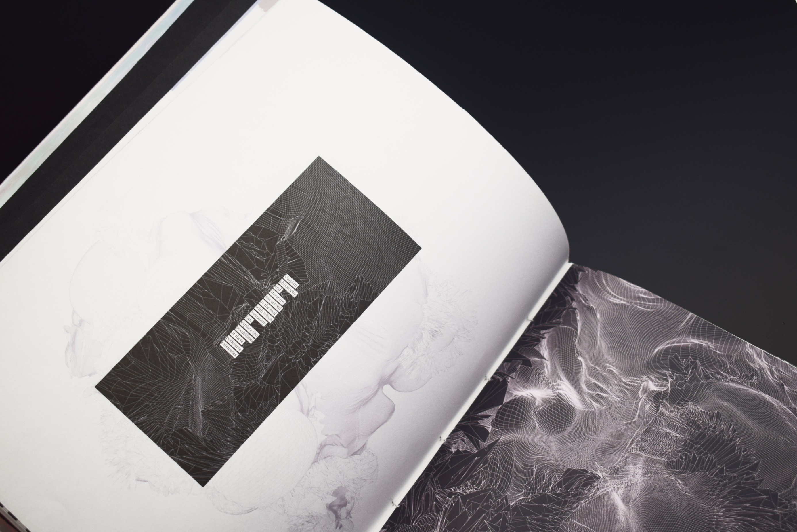
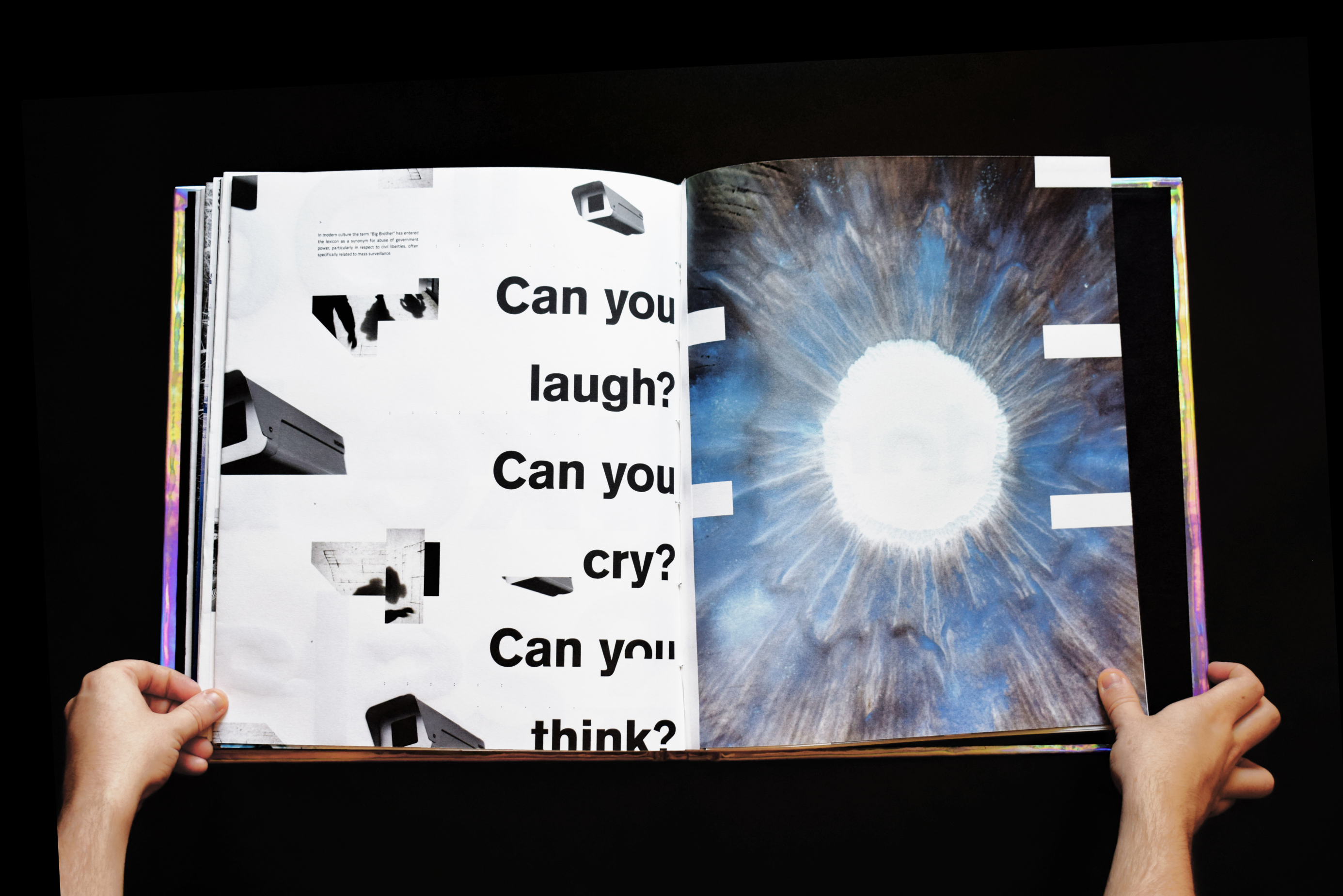
Utopia is a failed fiction. Throughout history there have been many attempts to create the ideal society. Although this concept is not new (first explored by Plato and then coined by Sir Thomas More in 1556), there have been many attempts at establishing the ‘perfect’ system where everyone benefits. These have repeatedly failed because of human nature.
Exploring the themes of individuality, freedom, justice and corruption, I investigate humanities attempts, both real and fictional at creating the ideal place. “Utopia is, and always will be two sides of the same coin”. One person’s Utopia is another’s Dystopia.
Client: University Project
Year: 2018
Outcomes: Custom size book, Digital Film, F.M.P Banner, ‘Utopia’ Symbol TypefaceDisciplines: Layout, Image Manipulation, Typography, Photography, Screen Printing, Book Binding
Physical Info:
The Utopia book has been made and designed to directly relate to the subject matter and themes of Utopian and Dystopian ideas. The book is in two parts. Part 1: Origins, which focuses on early Utopian ideas and Part 2: Dreams which focuses on later, modern ideas of both Utopias and Dystopias
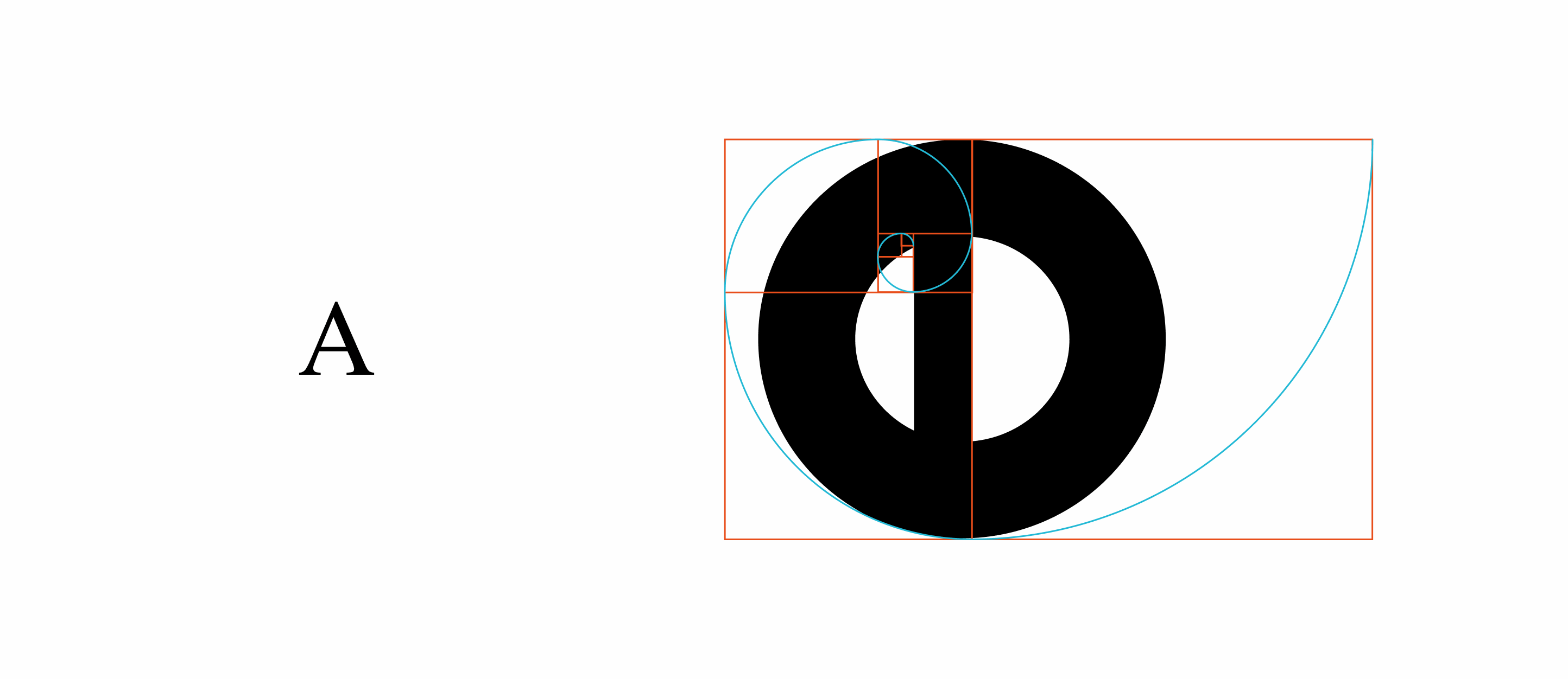
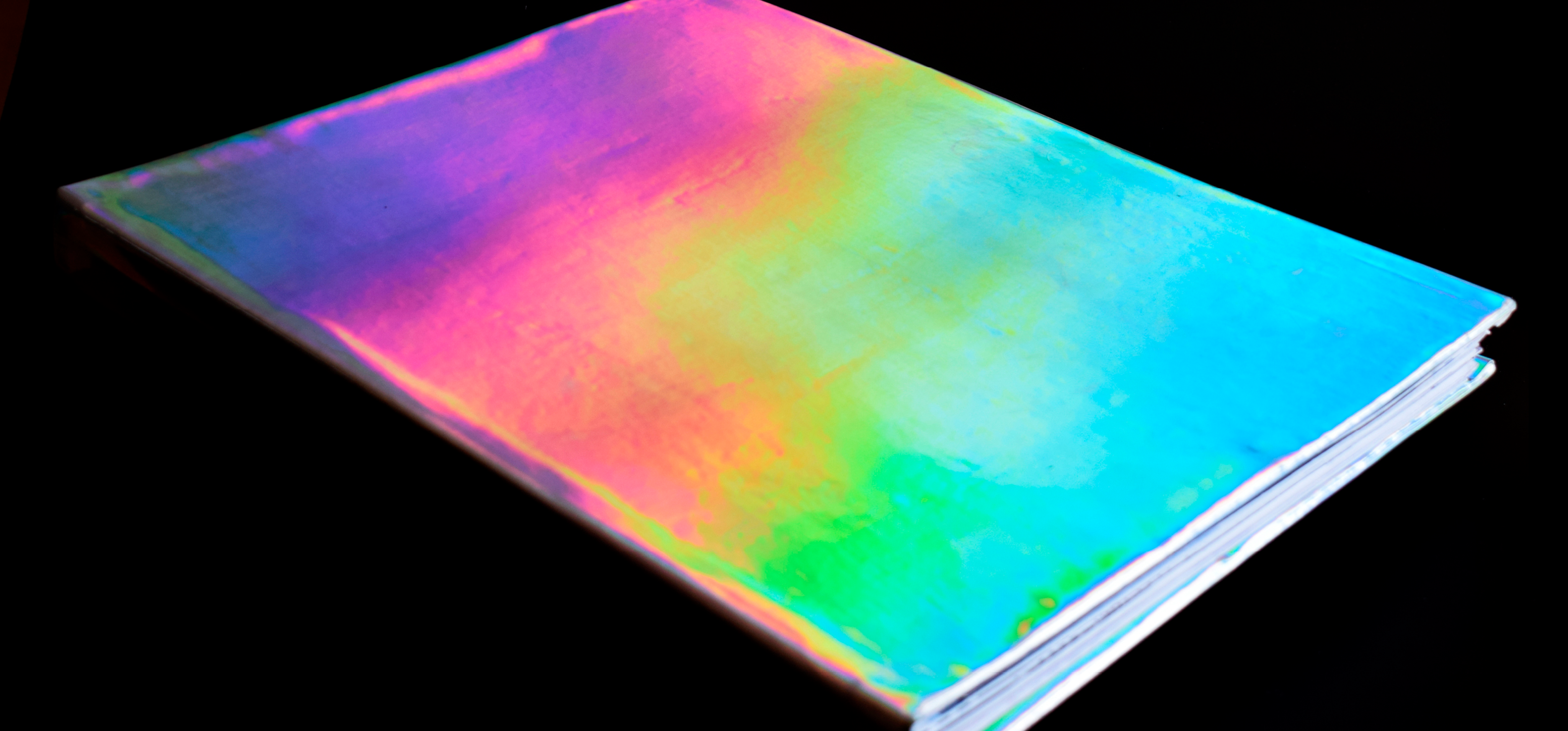
The book is custom sized and is designed using the fibonacci sequence (the golden ratio) when fully opened to give the impression of forced perfection. The cover of the book is made out of a holographic leatherette to give the book an iridescent and almost perfect, dream-like quality.
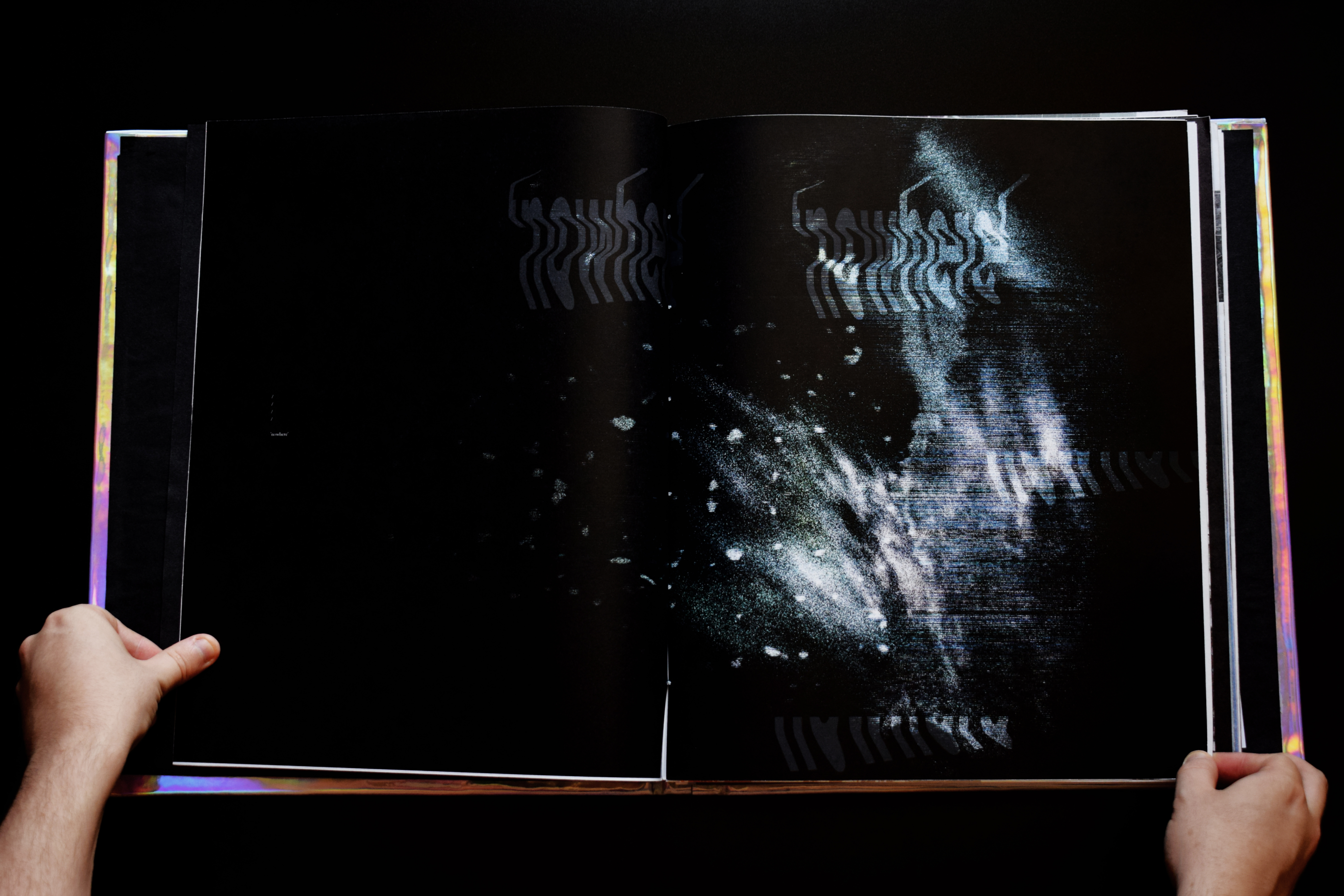
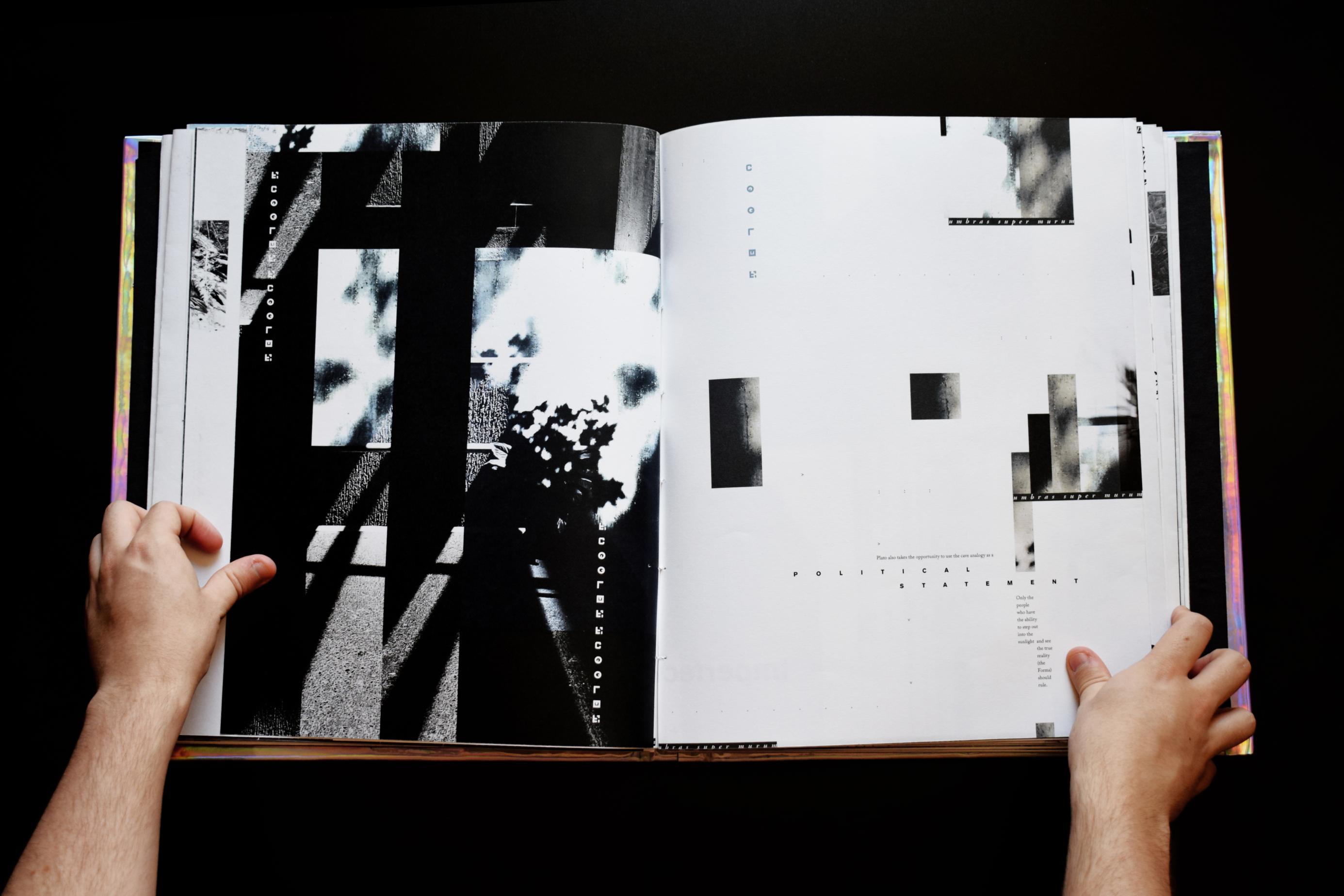
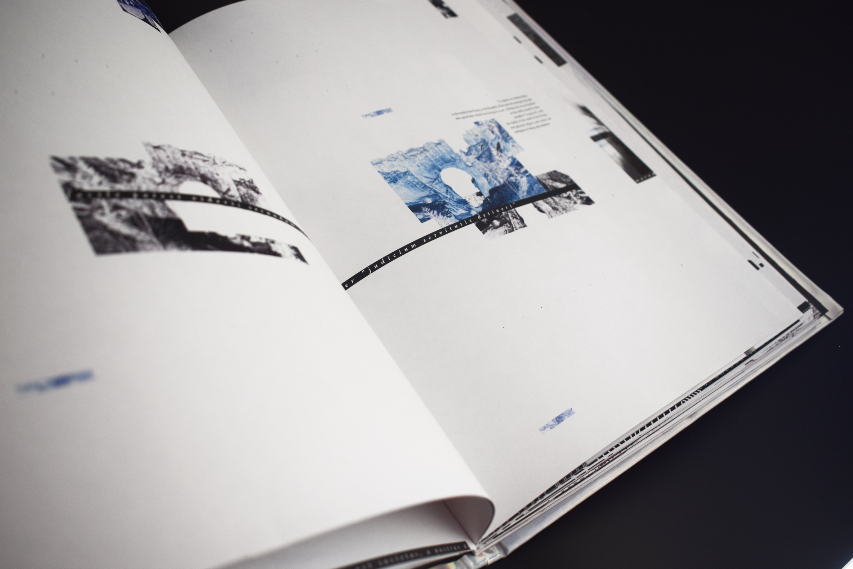
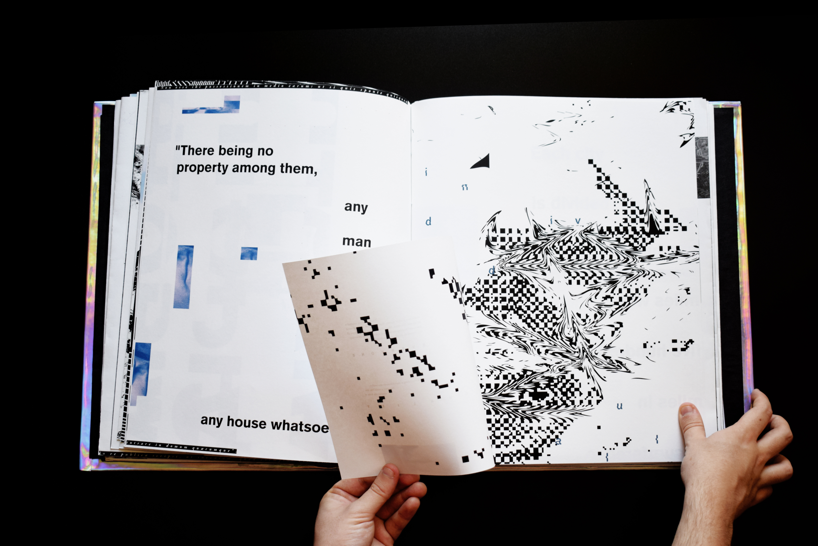
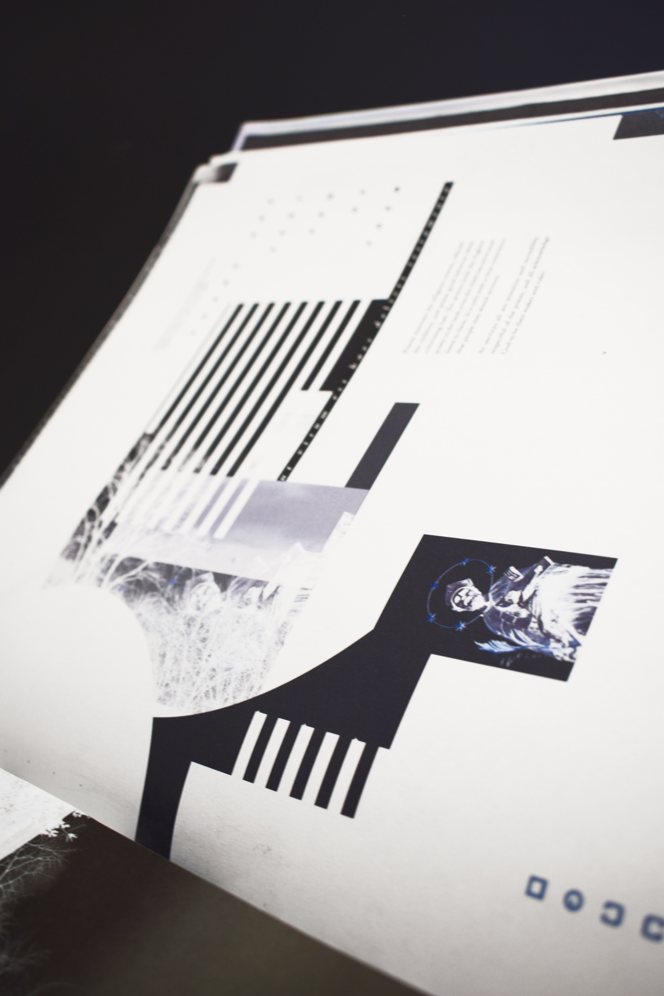
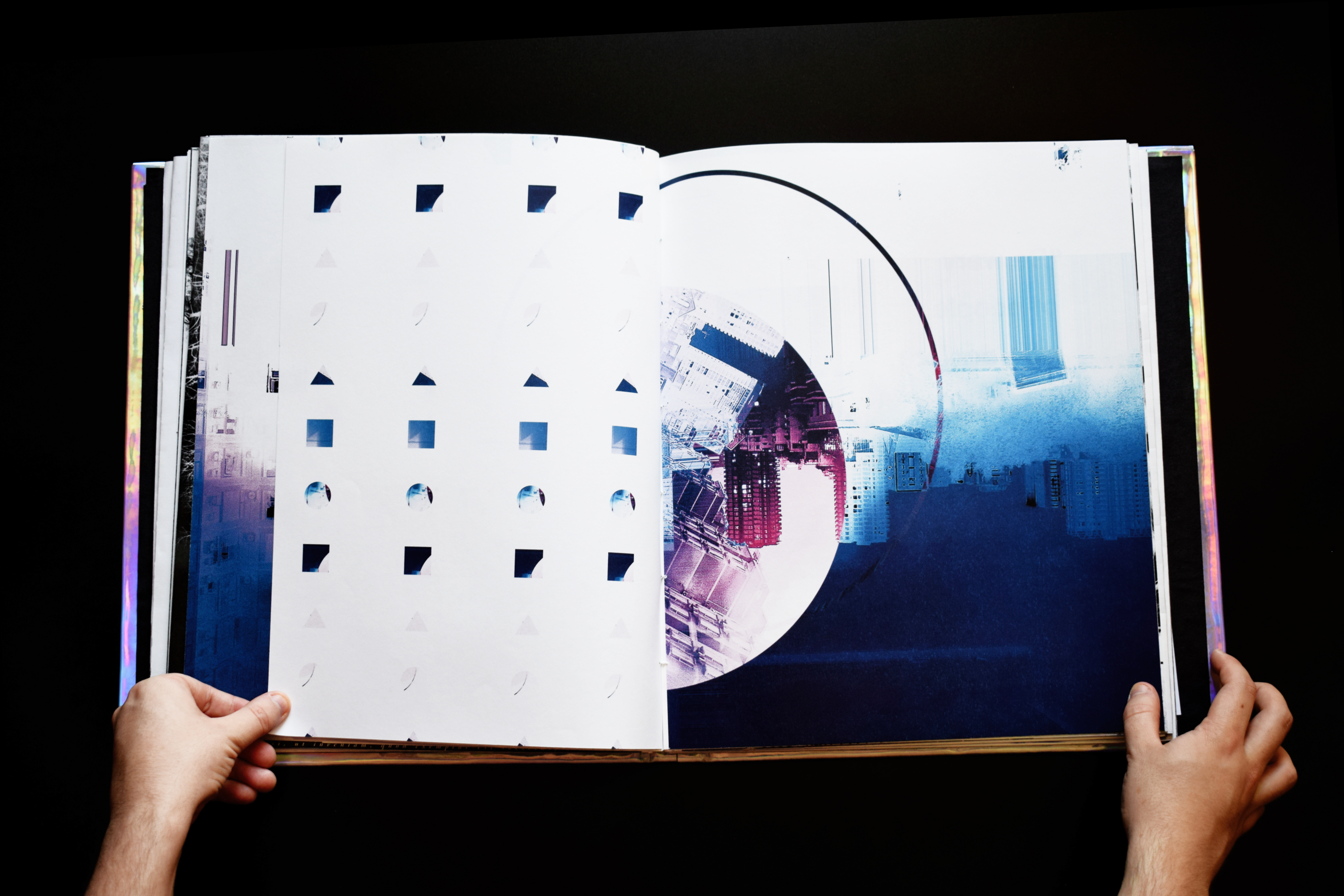
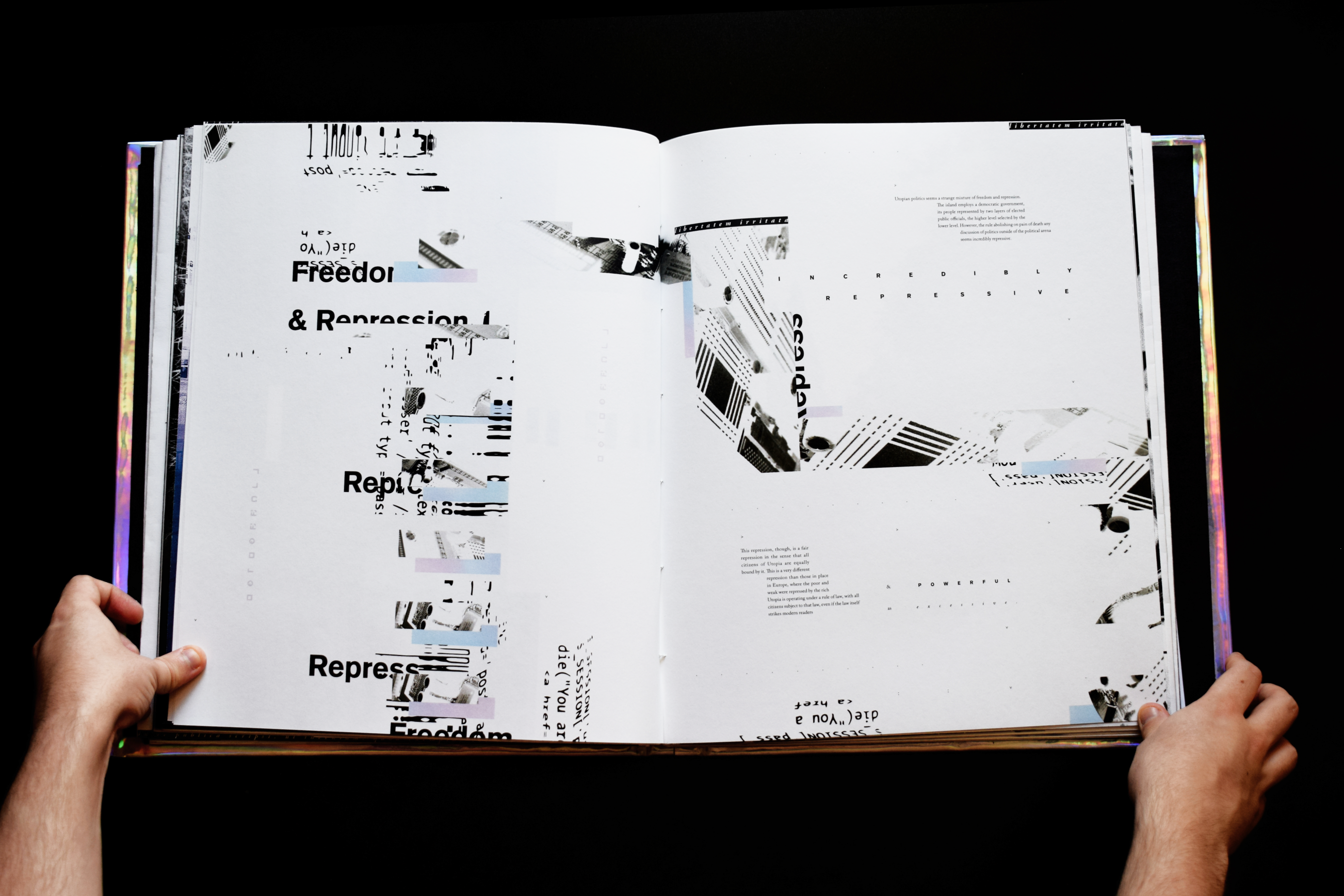
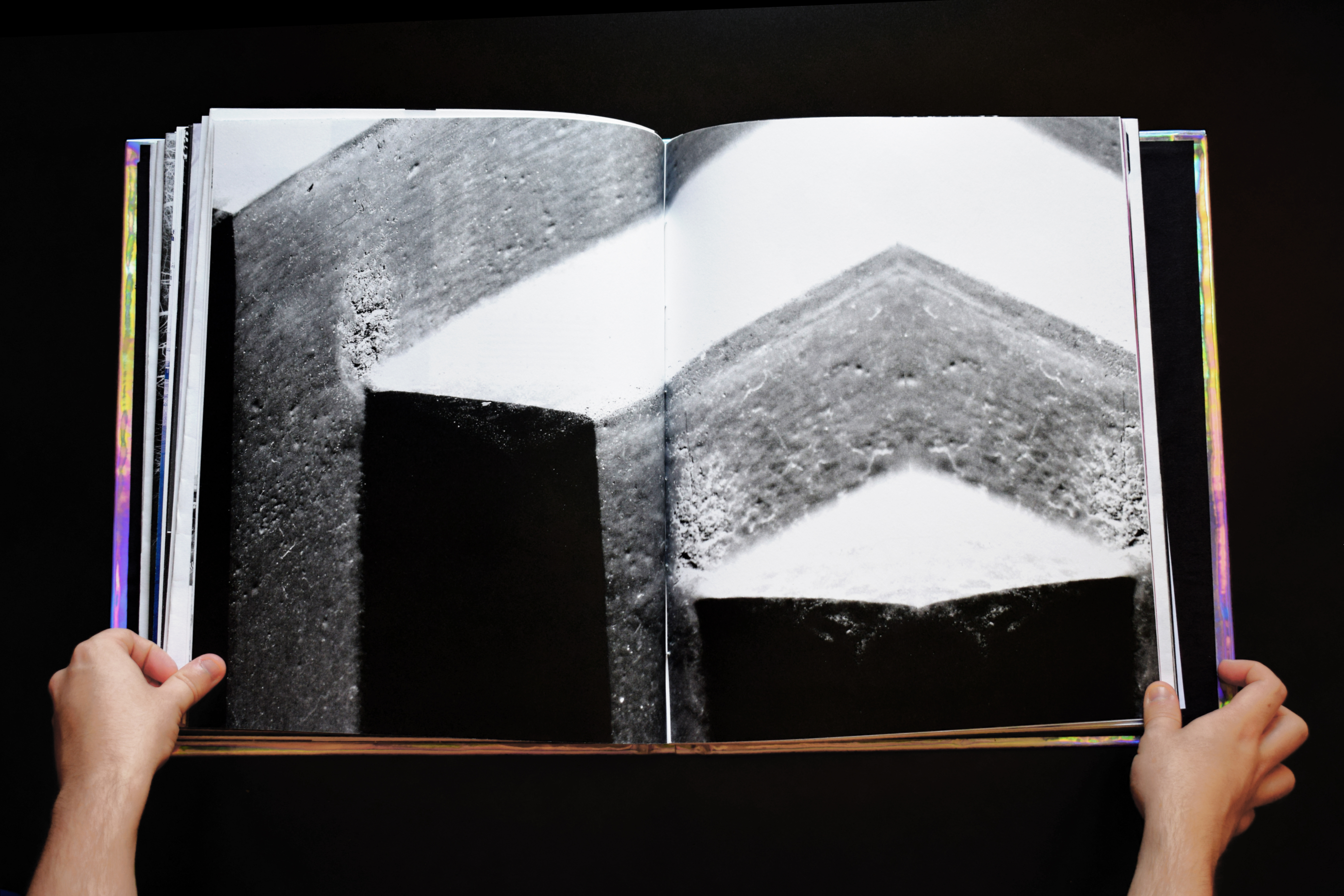
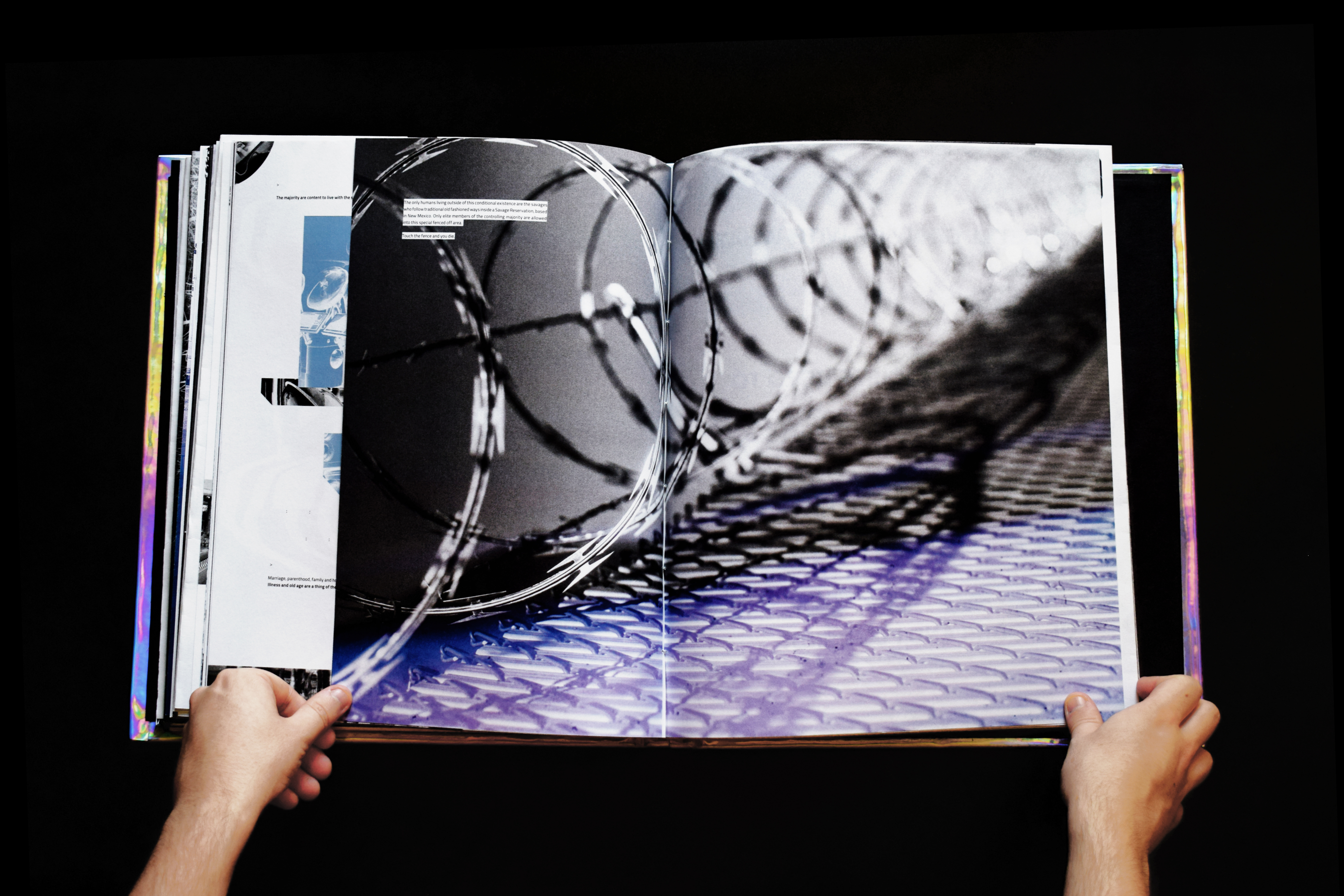
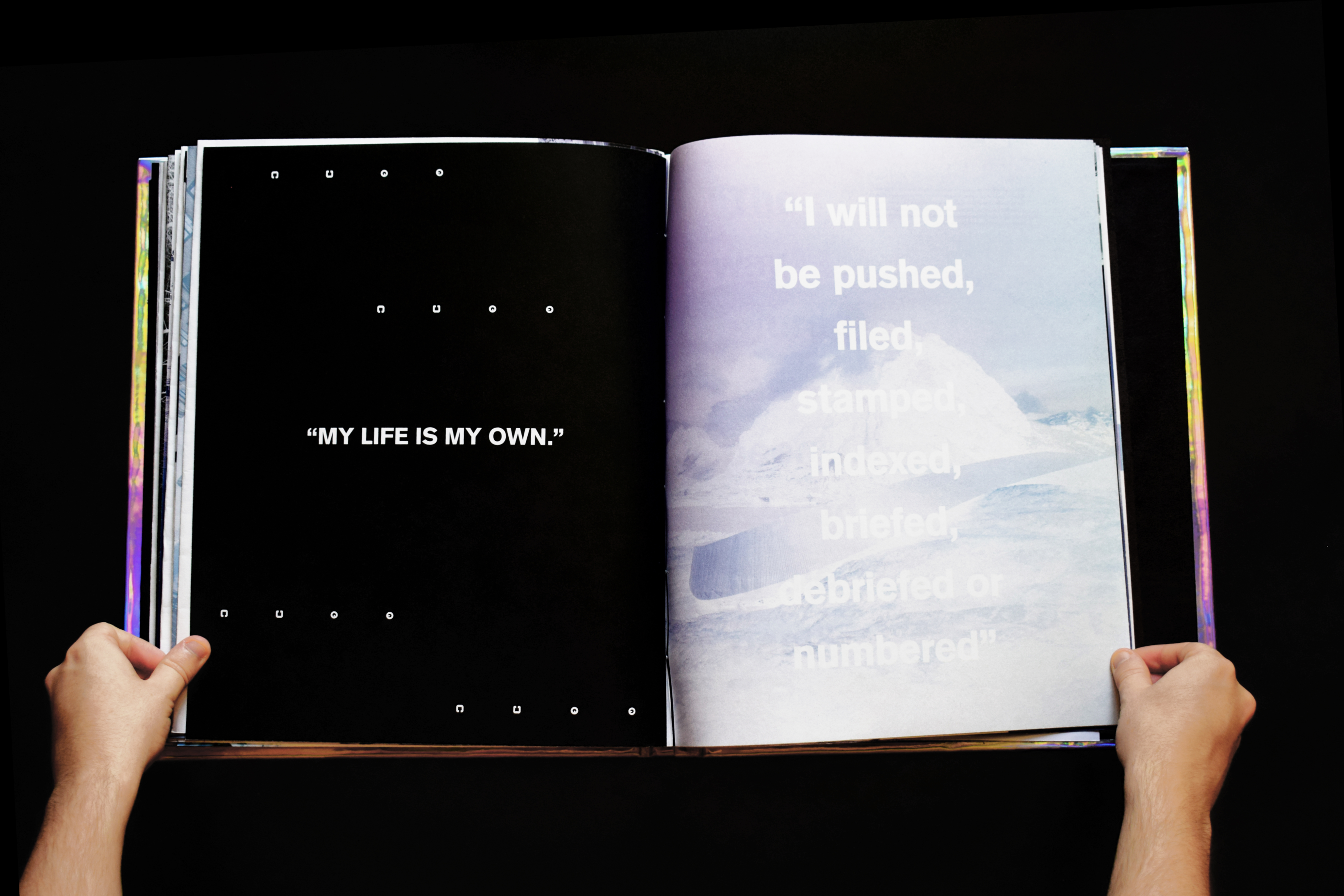
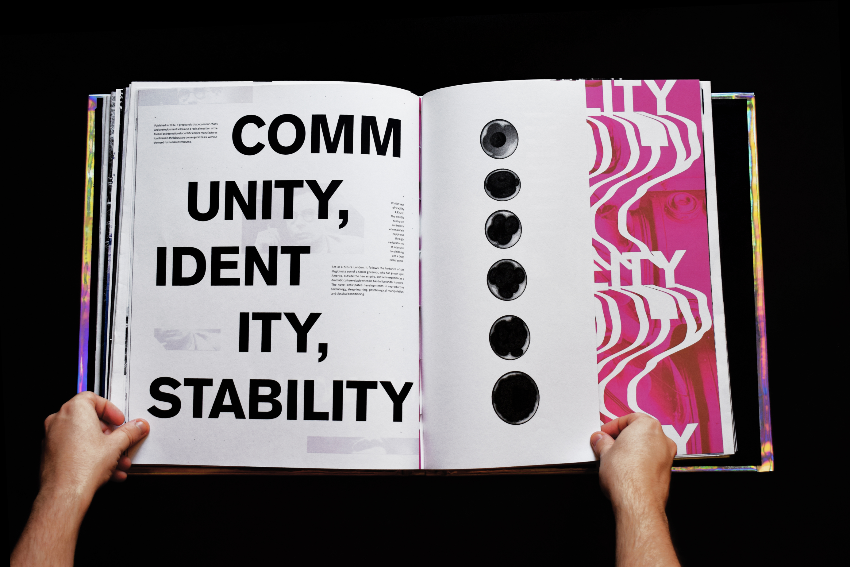
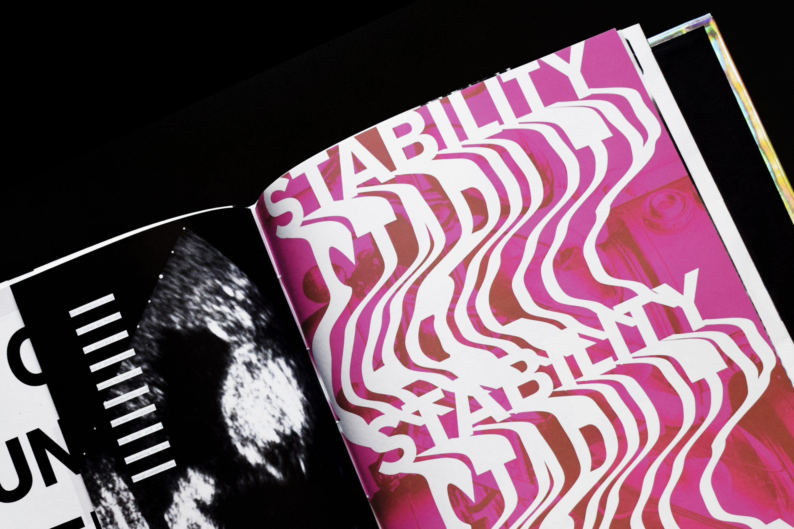
On the inside, the book utilises abstract typography and corrupted imagery. Part 1 uses more of a sporadic and minimal use of layout and typography which relfects the beginning of information on the subject which becomes more prevalent as the first part progresses.
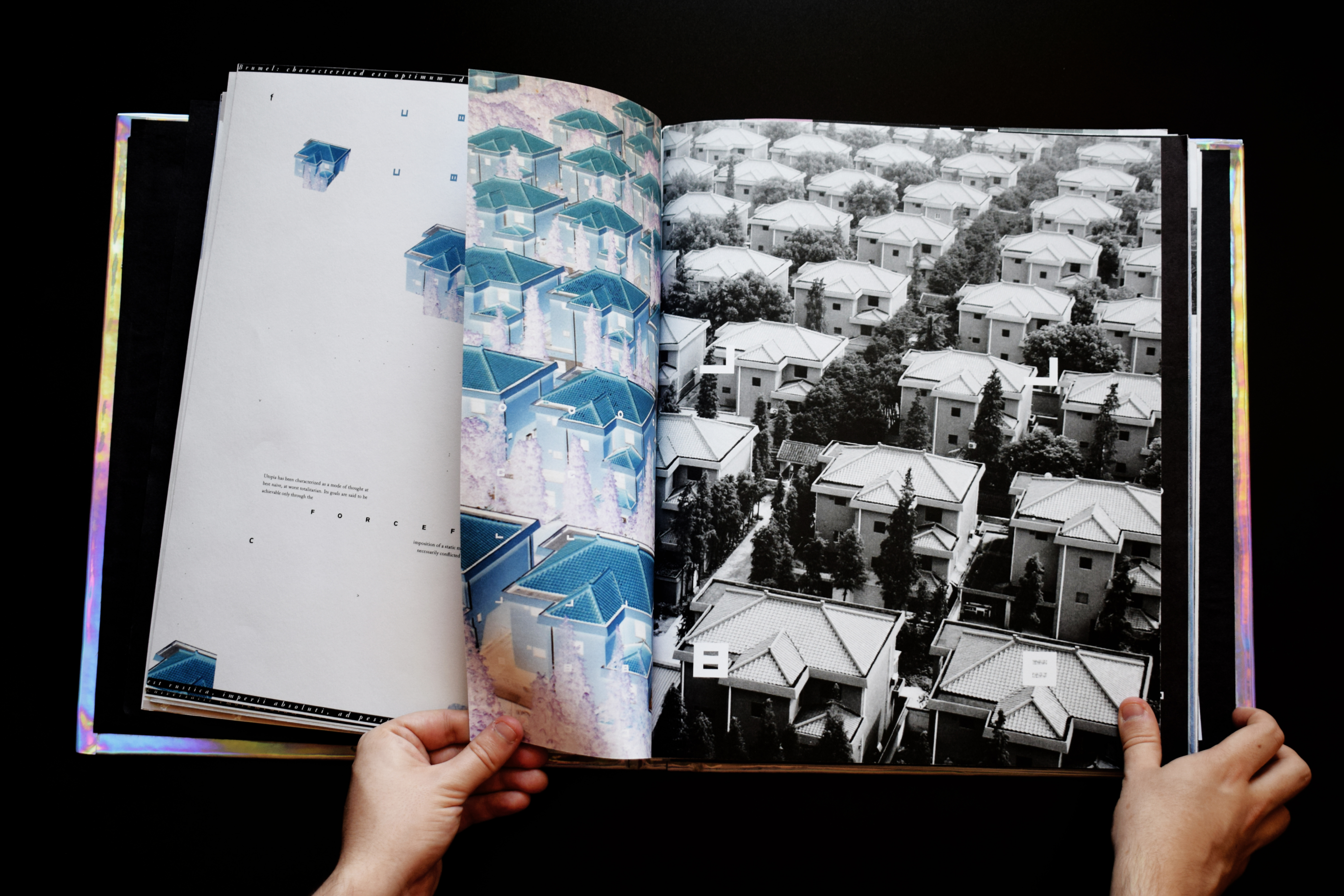
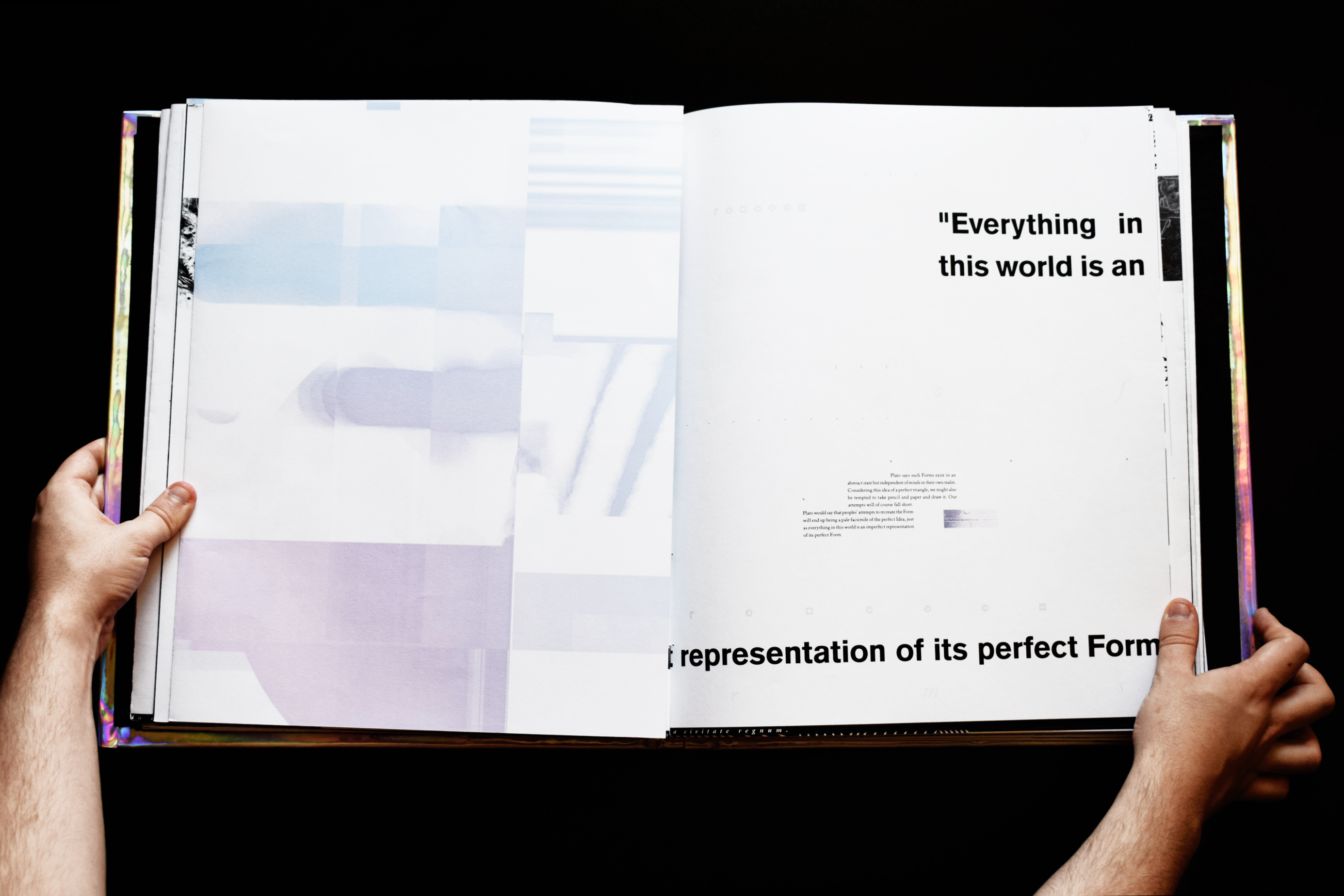
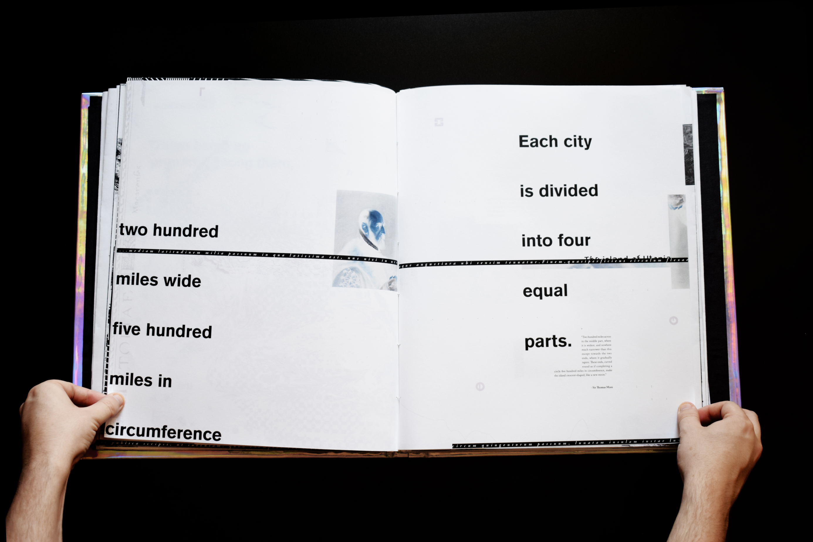
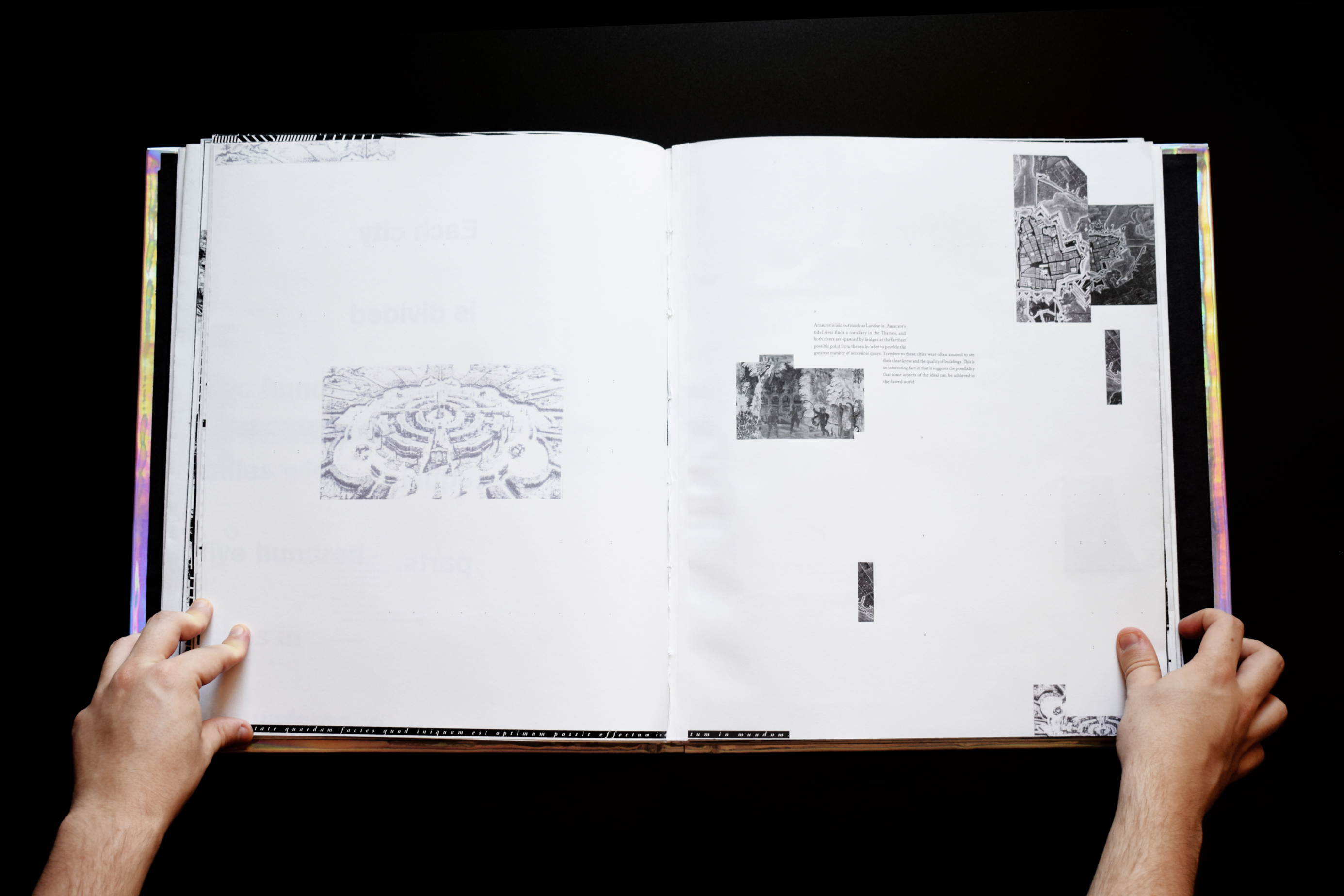
Part 2, although shorter, features a change of typeface, colour and uses more information than the latter, which reflects the modern and digital age which explores the modern ideas of Utopian thinking. There are also different paper stocks, half pages (to create image manipulations) and page foldouts to make the book an interactive experience.
All of these design decisions create a visual metaphor that Utopia’s are perfect on the outside; but when they are investigated there are always imperfect aspect depending on one’s place in society.
Part 1: “Origins”


Part 2:
“Dreams”


Utopia Digital Outcome.
Produced as the digital part of the Utopia FMP, this art piece video cryptically depicts both Utopian and Dystopian pop culture movies overlaid, inverted and spliced together to create an uncanny experience. This creates a visual metaphor that Utopias and Dystopias are one of the same. This is however, solely dependant on what part of society is benefitting and suffering from the same system.
As an art piece, this would be playing in the background where the whole FMP was displayed adding to the atmosphere of the project.
︎︎︎View the full video here
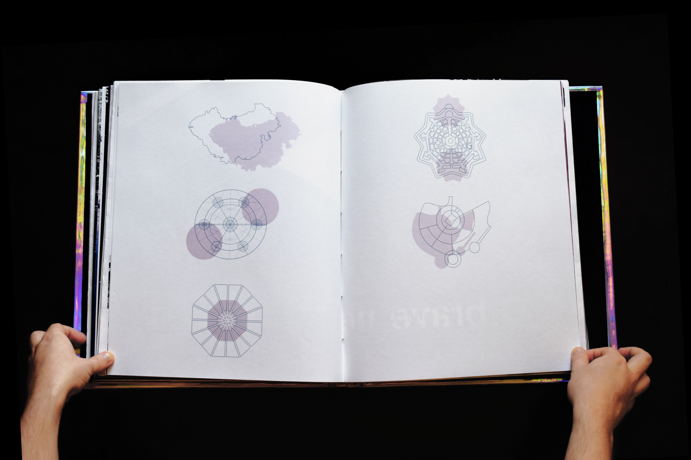
Modern Utopia Typeface
Created for the book ‘Utopia’ by Thomas More in 1516.
Although he did not create a unique language for the Utopians, he imagined that they would write in an exclusive, coded script. Like the island setting, this measure would provide the Utopians with greater self-containment and set them apart from the outside world.
Based on the original symbols from 1516, a modernised version was created with the Golden Ratio as the base to build the symbols from a grid.
This typeface is apparent through the Utopia book and the digital outcome as a homage to the original ideas of containment and segregation from Thomas More’s Utopia, and the ideas that are prevelent throught all Utopian and Dystopian attempts.